June 17, 2021 | Features

Talk to us about the back story/inspiration behind this image
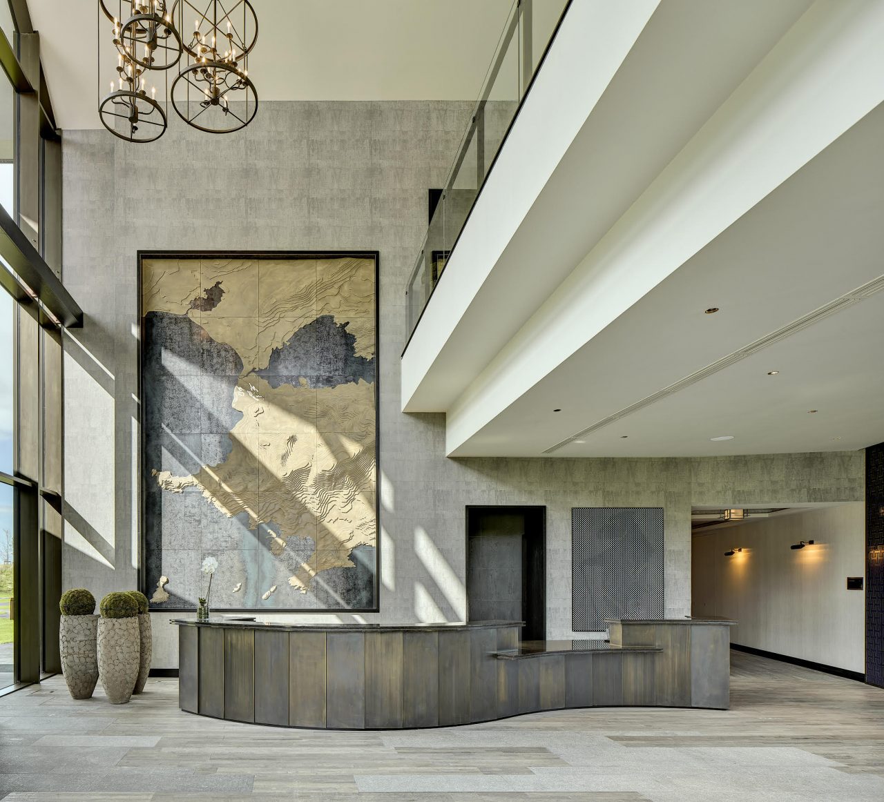
The image is from the luxury Lodge at Hogs Head Hotel, located in a stunning part of Kerry on the banks of Lough Currane. I was commissioned by the architects to comprehensively photograph the entire site over a 2 day period.
I started my journey into photography 26 years ago as a landscape photographer. Professionally, in a previous life, I worked for 16 years in architecture. As a result, light and shadow feature prominently in my architectural photography. I love to use the play of light to bring out the three-dimensionality of an interesting piece of architecture.
A one-point perspective is my favourite composition due to my other great love – cinema. I decided to set up the shot in this way. I always aim to make the viewer part of the scene. The camera is pointed directly at the subject rather than at an angle to give a cinematic feel.
Tell us more about the process. For example, we’d love to hear about your challenges or what went through your head while shooting.
When I photograph a project it really becomes part of my DNA during that period. The longer I spend shooting it the more I get a true sense of the shapes and forms that give the building its identity. The same applies when shooting landscapes. I can spend an entire day photographing a landscape scene, soaking up the place.
I walked around the site with the architect early on the 1st morning. I then photographed the building to maximise the direction of the light. I photographed the hotel on the lakeside in the morning so the morning light would hit the facade and stream in through the glazing of the wonderful restaurant and lounge area. I focused on the entrance side later in the afternoon and evening. Each day finished with a series of dusk and night shots celebrating the location of the hotel beside Lough Currane.
Tell us a little bit about the technical aspect of this image.
Initially, I look at what elements play a positive role in the design of the building and aim to use these during the course of the shoot. I always use the least wide lens possible for the shot. Less is more for interiors photography. I wanted to have sunlight hitting the back wall to give depth. I knew diagonal shadows would be formed from the glazing transoms. I needed these to run down the wonderful artwork on display at the reception. I wanted it to feature prominently in the final image.
I removed a number of functional items which would detract from the scene. I positioned the 3 large potted plants until they created a nice balance to the shot and I worked with the receptionist so that the image would not look staged. Square and panoramic format are my favourite way to compose a scene.
In both cases, I use shift or rise on my Tilt-shift lenses to get the composition I need and then stitch them together later in photoshop. I never tilt the camera with the idea of straightening verticals later in photoshop. This is a big no no for me. Moving your physical position even 30 cm in a scene is the difference between a good and perfect composition. My background in architecture is hugely beneficial when setting up both my architecture and landscape compositions to create that perfect balance.
How did you feel right after taking this image? Did you know instantly it was “award-winning”?
I never contemplate whether it will be an award-winning image when capturing a scene. If a photographer thinks that way then they are shooting for others and when I say others I don’t mean my client. My focus is purely on capturing the very best image for my client to show it in a way that is purely my vision and not corrupted by other influences.
From your point of view, what are the key elements that make this image successful?
My shots are always about achieving an optimal composition. Whether it be my fine art or commercial work. I feel an emotional response each time I know I have the right composition. These compositions appear as snapshots in my mind when I see the scene for the 1st time. I shoot very much with a gut instinct. And I love that sense of excitement when I physically compose a shot successfully that aligns itself with that vision.
A one-point perspective was key. Good positioning of the various lights and props added balance. The diagonal lines of the ceiling leading the viewer’s eye toward the reception wall focus attention where it needs to be. Sun and shadow created a wonderful mood and depth. All of these resulted in a shot I am now extremely happy with.
No Comments